Call me old-fashioned, but I love sending – and receiving – postcards (I’m not the only one). It’s a ritual I have when I travel. It’s an excuse to browse postcard racks in strange little souvenir shops, find a cafe to sit in with a drink and ponder your trip, before crafting your thoughts into a message. I’ve just one issue. Designs these days are either uninspiring or plain cheesy, leaving me feeling underwhelmed or cringing. Honestly, I wish travel postcards still looked like these vintage ‘Greetings from..’ designs. There’s nothing I don’t like about them. I love the font, the colours, the cheery air-brushed illustrations, and taking in all the little details. They capture the spirit of adventure in a lighthearted way and make me feel excited for travel – however significant or little-known the landmark or place represented. I’d be just as thrilled to send them as I would to receive one.
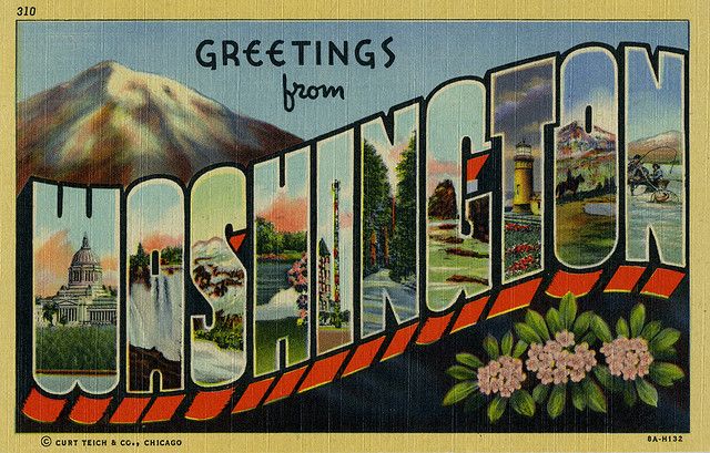
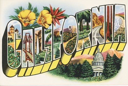
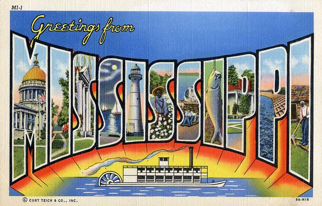
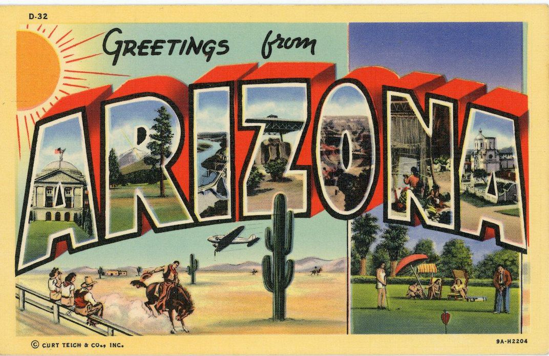
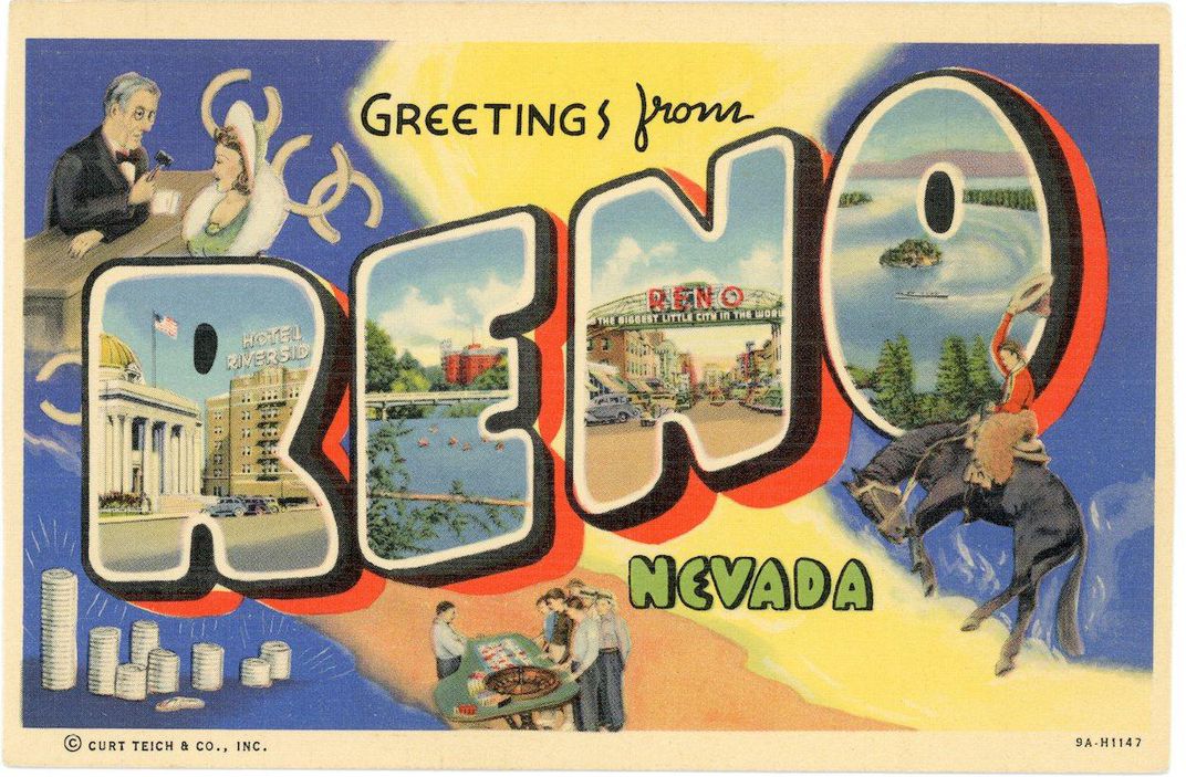
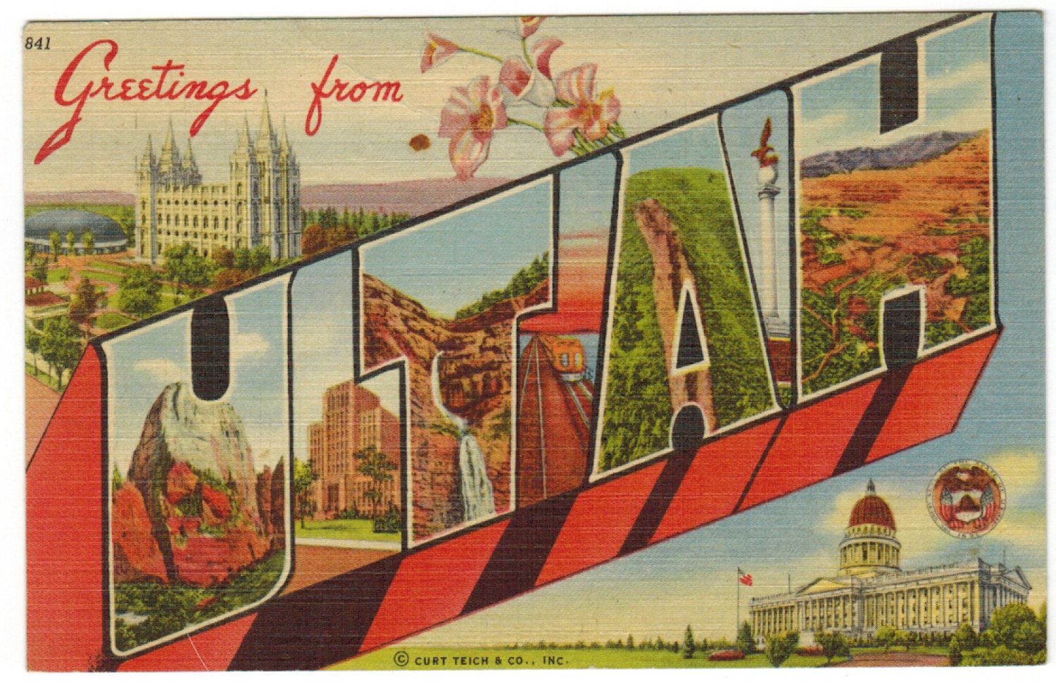
The reason I’m writing about them today, is that I just launched two vintage-style postcards of my own. While I was researching designs, I found out the story behind them. They were popular in America during the 1930s, 40s and 50s. This is when road building was in full swing and the country was becoming obsessed with the car, car travel and car culture and people were thrilled to discover new places. They typically depicted American scenes, ventures, buildings, businesses – from the country’s smallest towns to its grandest natural wonders and were often referred to as ‘large letter postcards’ or ‘linen postcards’ for the textured effect created during the printing process.
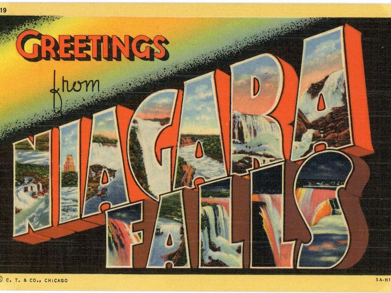
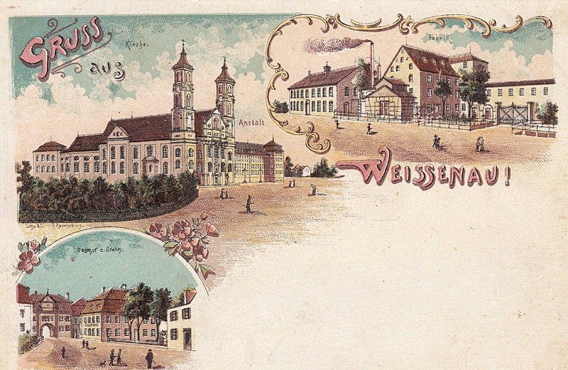
They were created by a German immigrant called Carl Otto Teich who saw an opportunity and became incredibly rich and successful as a result. They’re inspired by the “Gruss Aus” (“Greeting From”) postcards Teich had known as a young man in Germany, which were similar in that they featured local views, but different in that the lettering was more subtle and a muted colour palette.
Teich took the design and colour palette up a notch to create his American version. Featuring the name of a state, city, or attraction – emblazoned in large 3D letters – with miniature images of regional scenes depicted within, and an overall bright colour palette. He also developed a printing technique which led to the canvas-like texture created when a photograph was retouched, then printed to maximise the brightness of the coloured ink.
Businesses that depended on tourism saw Teich’s cards as a great way to draw in customers who were drawn to the cheery colourful designs on the racks in local pharmacies or service stations. He soon realised the scope for producing these was endless and decided no place was too small to be photographed! Wasting no time, Teich employed am army of sales representatives to set up and manage regional accounts, who often went out on assignment to photograph sites!
They advertised motels and motor courts with clean rooms and radios. Roadside eateries’ cards showed off delicacies: fried clams at Howard Johnson’s restaurants on the East Coast; shoo-fly pie at the Dutch Haven in Lancaster, Pennsylvania; all-you-can-eat chicken dinners at Zehnder’s Restaurant in Frankenmuth, Michigan. Cities advertised hotel accommodations on linen postcards, too, hawking stylish supper clubs with music and dancing, and restaurants with fine dining and cocktails.” (Smithsonian)
Apparently, ‘deltologists’ – that is people who study postcards – estimate that Teich and other copy-cat publishers developed over 150,000 different images and printed millions of this type of postcards at their peak. When Curt Teich died in 1974 at the age of 96, four years later, his company closed and his family donated nearly half a million postcards and artefacts to the Lake County Discovery Museum in Libertyville, Illinois. The collection was moved to the Newberry Library in Chicago in 2016 and there’s now an incredible digital archive you can lose yourself in here. Have a look at my postcards, here.


